Introduction
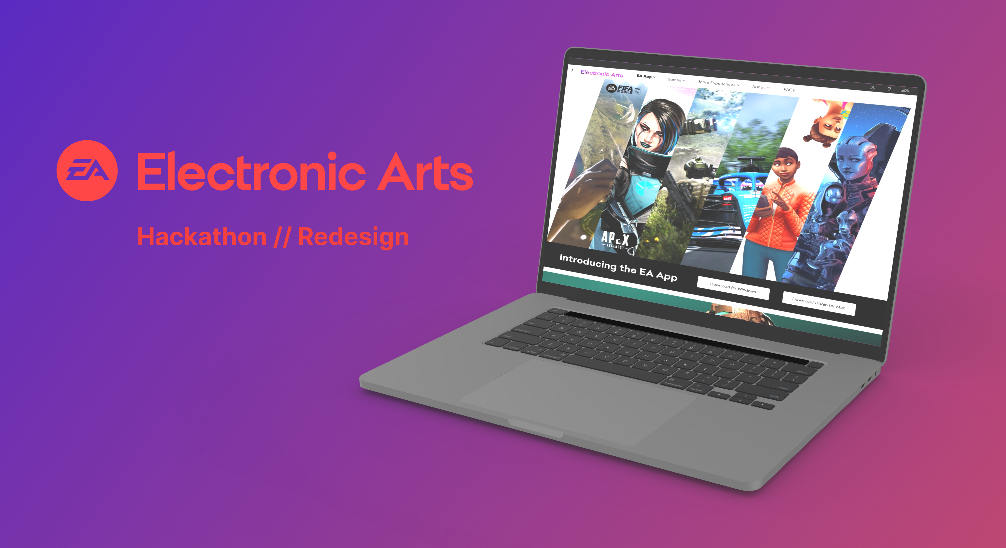
Company / Electronic Arts (EA)
Type / Redesign Proposal
Team / E-ATeam : 4 UX Designers, 2 Web Developers
Role / Asset Collecter, Maker, Stitcher
Tools / Figma
During my Diploma journey with BrainStation, they were approached by Electronic Arts (EA) to host a Hackathon: the ask? How might we ensure the EA App is adopted by current users.
EA is switching their game launcher from the Origin platform, to their new product, the EA App, but it's not been widely adopted by existing EA Origin users. So where's the problem?
Proccess
Context
We allocated the first three hours of our twenty-four to undestanding where the current users painpoints or potential error points were in converting to the EA App in substitute for interviewing. We leveraged first person reviews and posts on social forums alike Reddit.
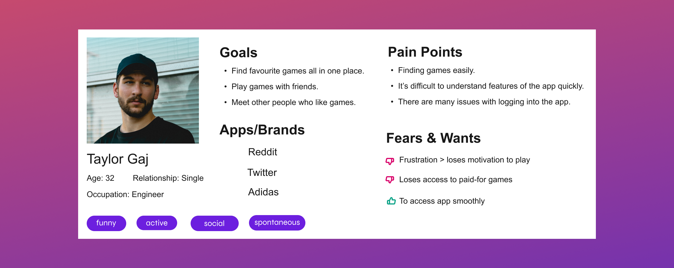
Persona
At the end of our three hours, we consolodated our findings to create our Proto-Persona, Taylor. Taylor has change-aversion, he enjoys the simplicity of the routine he's familiar with, and doesn't feel secure in his understanding of what the EA App offers over Origin.
From here we decided to do an Inventory of the current solution to finding information on the EA App through the EA site-
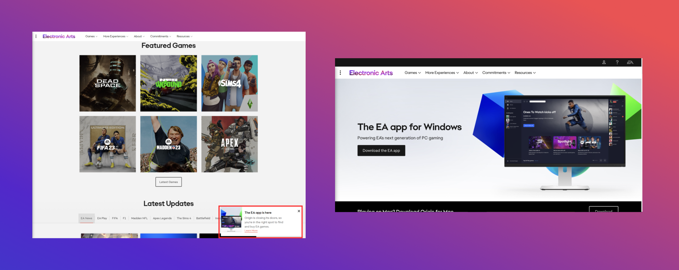
We found that the current homepage has the EA App listed in the 'More Experiences' dropdown menu, and a small popup about the EA App replacing Origin which takes you to a blog post.
From here, we as a team decided the options to increasing adoption wasn't in changing the EA App to make it more appealing, but to make the answers users need more accessible, and in more engaging language.
Findings
A Twofold Intervension
Increase EA App exposure on the EA site so more casual viewers could discover it immeditely, rather then accidentaly or through searching, and to increase user trust in the EA App through clear, relevant, and engaging information.
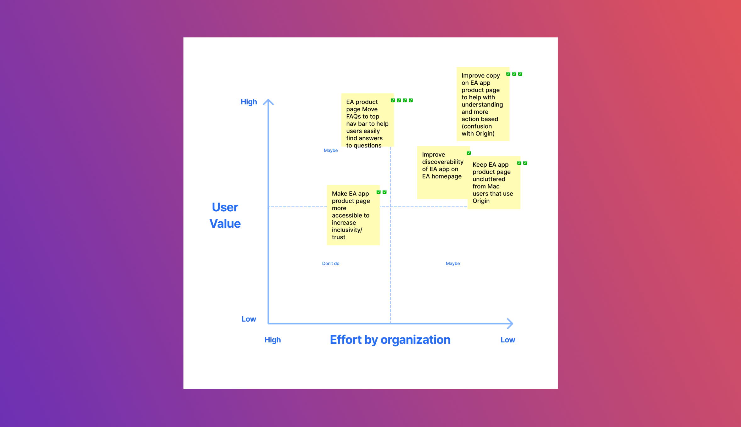
Considerations
Social Media campaigns as a form of user testimonials, a Redesign the EA App page and EA Home page, highlighting the FAQ section, and a Twitch streaming campaign.
We plotted our options on a Design Matrix, and decided the Redesign and highlighting the FAq sections were both doable, and created the most imapct for the broadest range of users.
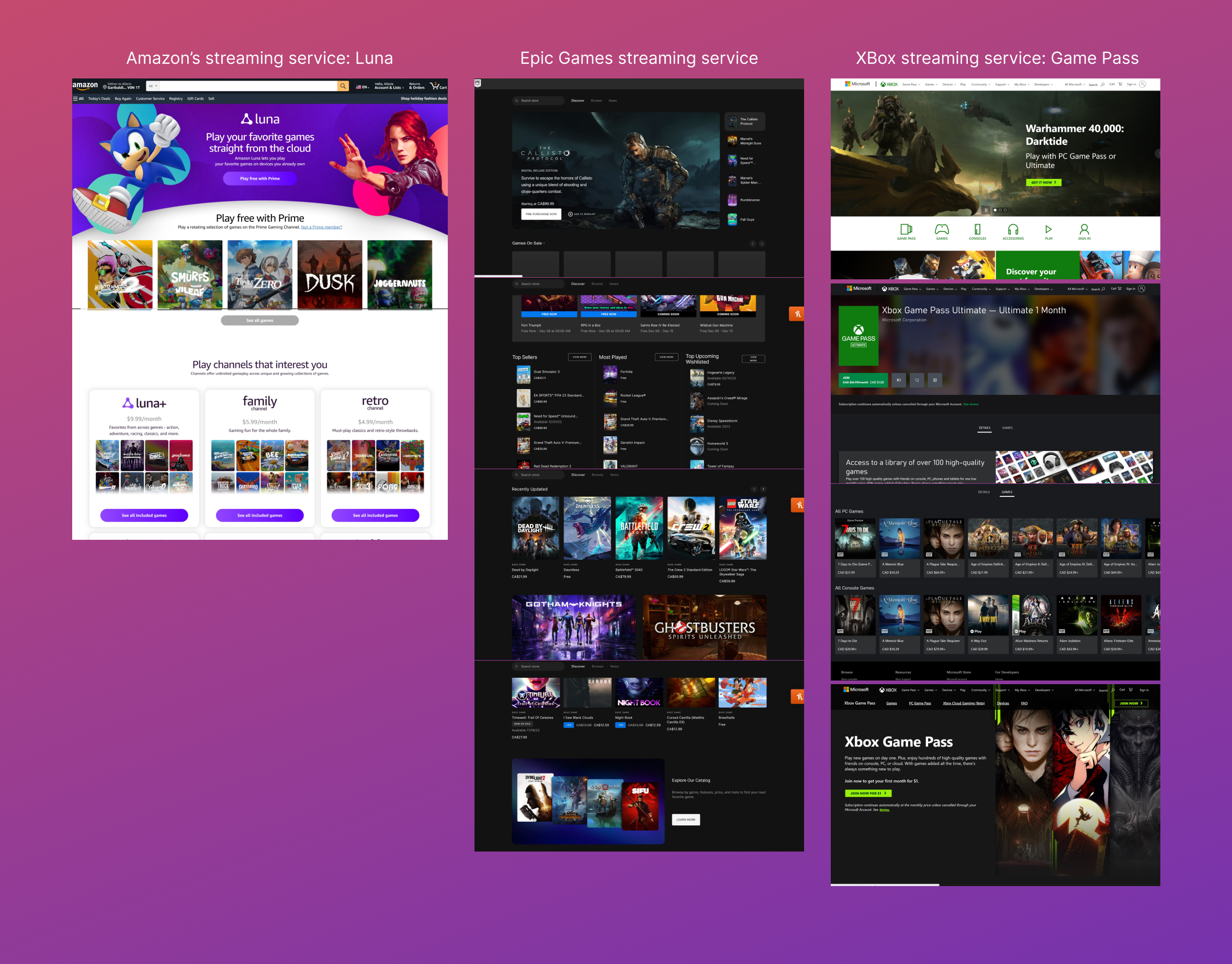
We went to a range of competitors, some with game platforms, and others that are solely for streaming, so see how they advertise their products and services. We realized that a theme of actionable language and show-don't-tell organization was prevelant in their landing and product pages.
Competitive Analysis
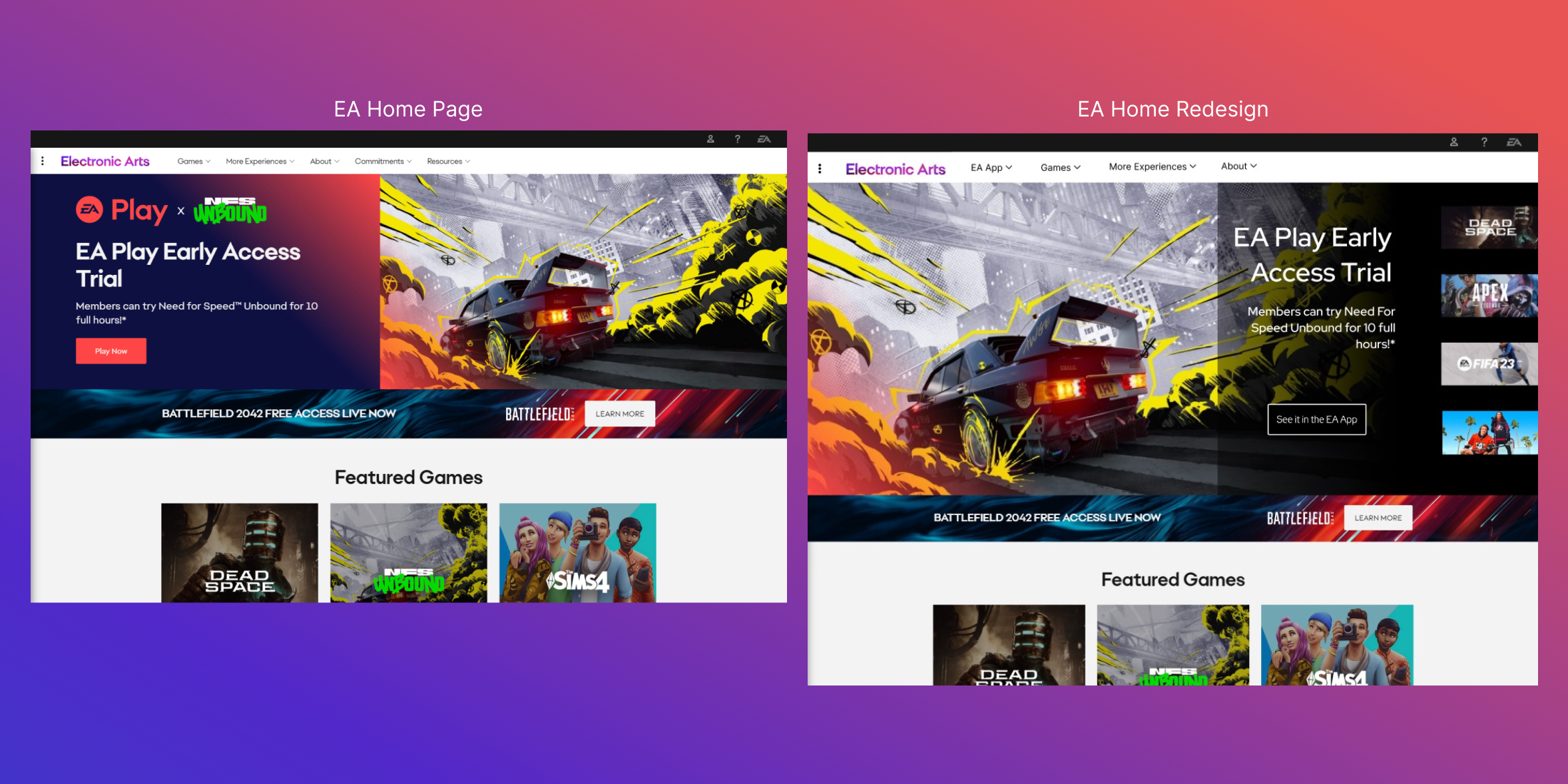
Implimentation Part 1
We chose to switch out the existing banner on the Home page for one that showcased the top games EA was already highlighting, pairing it with a CTA to the EA App, while simulatniously adverising their subscription service, EA Play.
In the header we resorted the addtional items of 'Commitments' and 'Resources' into the 'About' dropdown item, replacing them with a direct EA App menu item next to the logo for maximum visibility, and an FAQ spotlight.
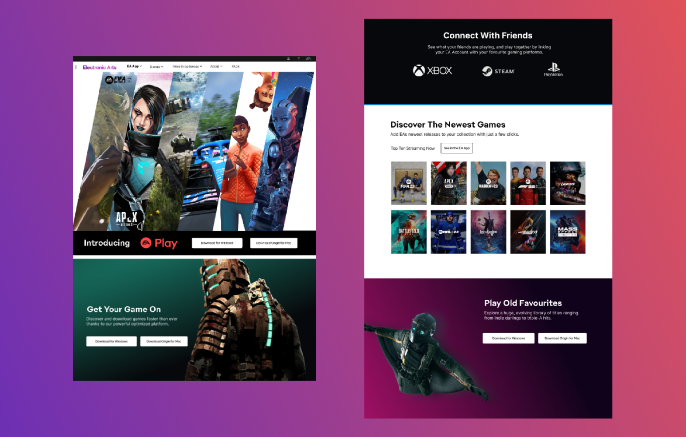
Implimentation Part 2
For the EA App specific page, we didn't remove any of the existing items, but re-worded the copy and sorted them by importance. We really wanted the users, and our Proto-Persona, to find the most valuable information on what the EA App offers quickly, and in an engaging way.
We wanted each section to feel compelling, like the user need to just click the CTA and be transported instantly into a new world of gaming.
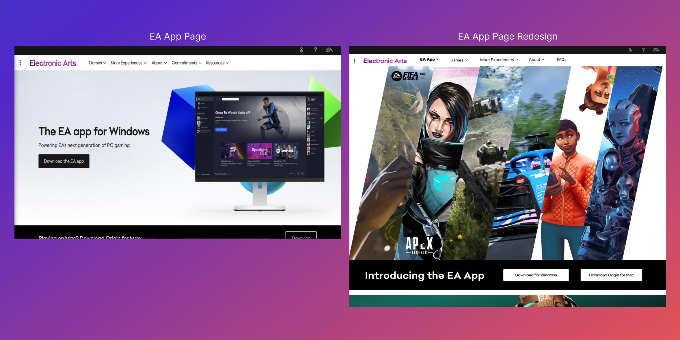
We removed the existing graphics and EA App mockups for gaming character parallaxes, and sleek transitions, inserting a 'Top Ten' list to showcase the range of EA's newest offerings towards the bottom of the page. We felt this would help convert any users that had been considering adopting the EA App to join their friends in a specific new release, but had been unsure if they wanted to trust the EA App to be their launcher.
Feedback
From the EA Reps
"Great storytelling, and narrative, providing context to the EA App experience through actual user views."
"Effective consideration for an imagined end user with the proto-persona."
"Prototype is very well designed and makes effective use of motion design and animation."
"I appreciate the thorough research & that the group used EA assets."
"Web dev styling is almost identical to the UX, which is super impressive."
"Love the team name!"
Experience It For Your Self
Other Case Studies
JB WoodworkingBranding
Crisis Center BCRedesign Proposal - Design Sprint
Plein-RefuseCapstone Project
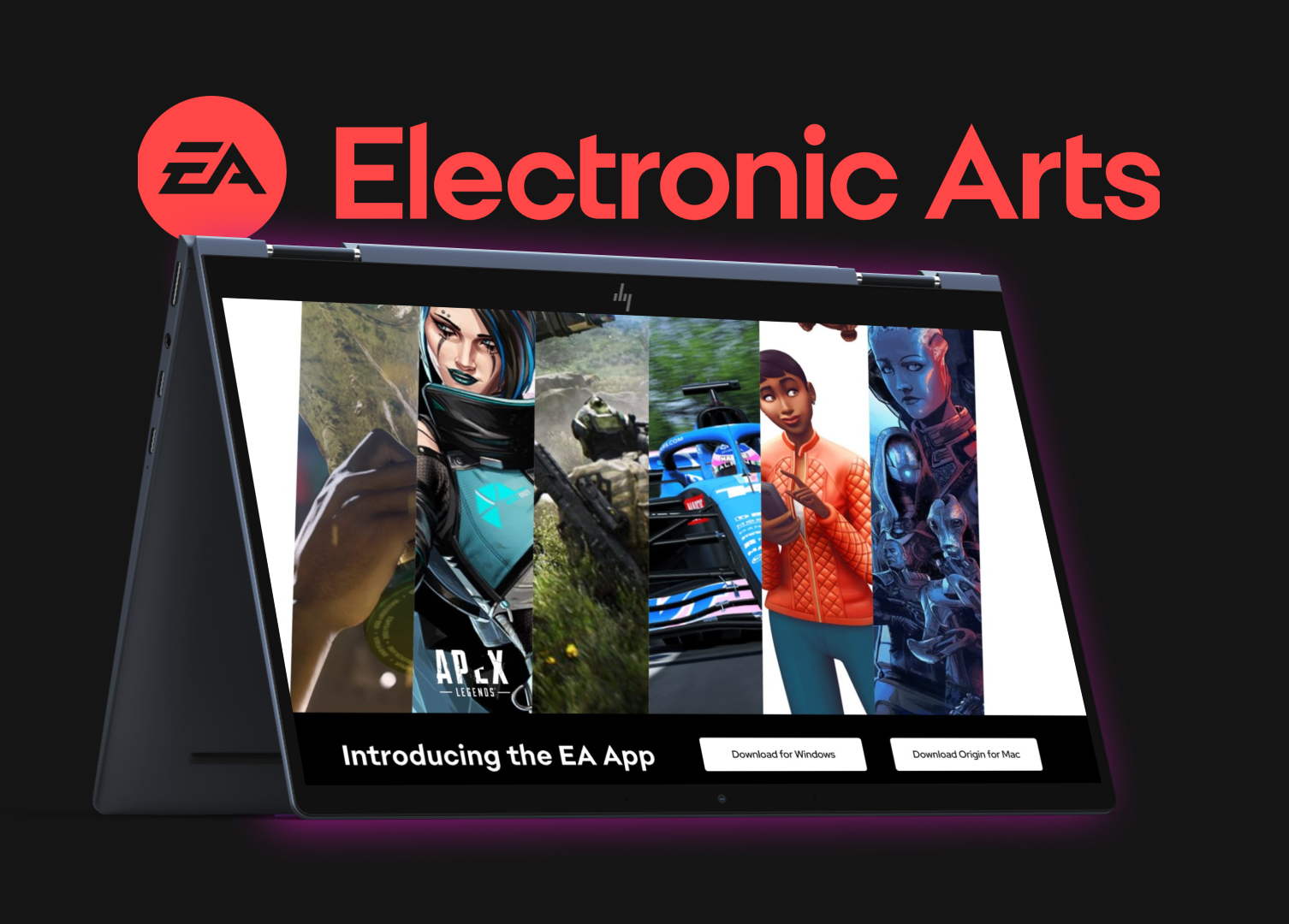
Electronic Arts (EA)Redesign Proposal - Hackathon
AL VERHEIRE